2018 Colour forecasting

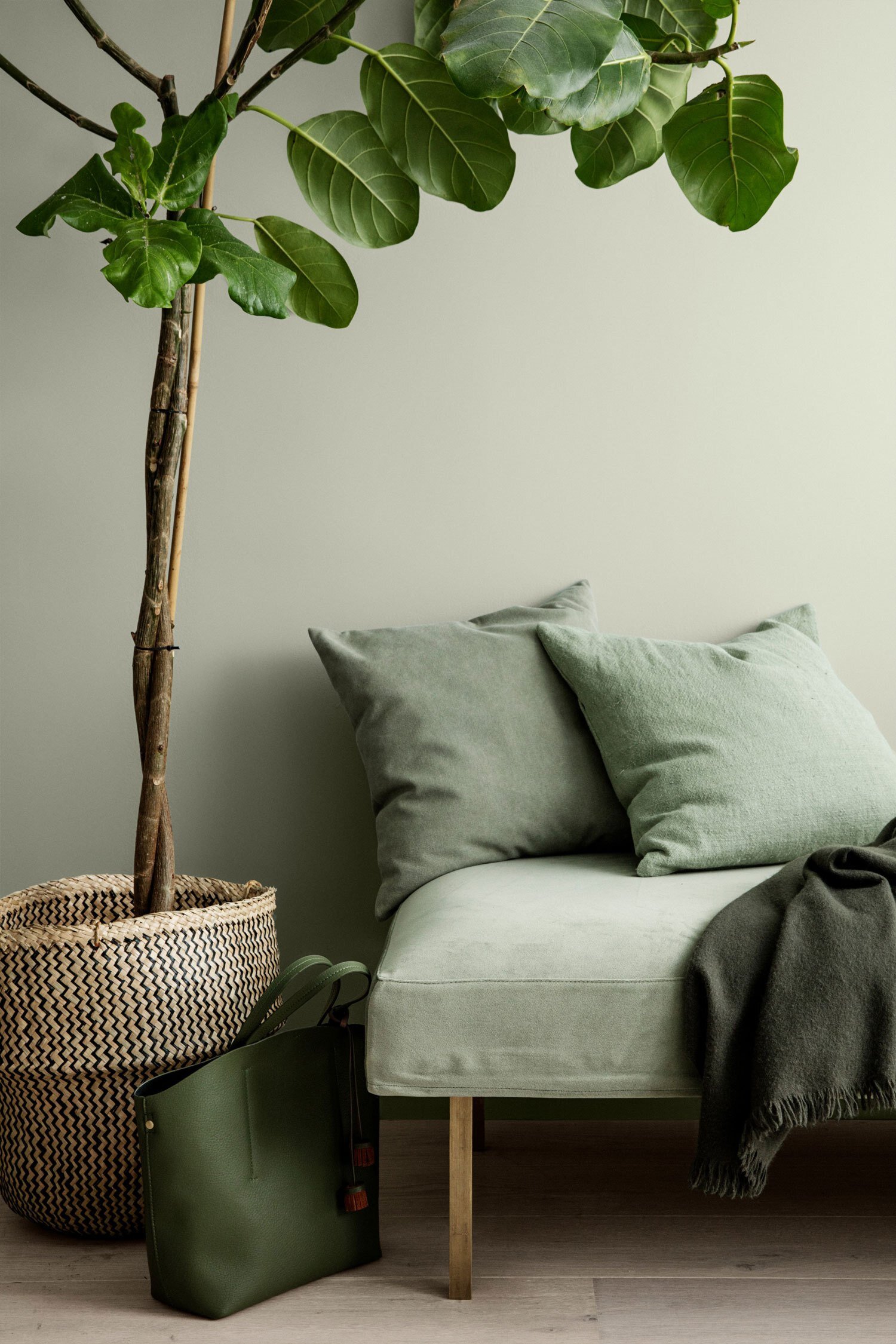
Jotan, the Norweigan paint manufacturer shares it annual colour card, a culmination of a year of global lifestyle research, and the unveiling of the 32 shades that will define interiors around the world in the year to come. Entitled Rhythm of Life, the colour card is a snapshot of the ideas, realities, values and aspirations shared by people around the world.
‘How people think and what people dream of is actually surprisingly similar whether you live in Muscat or in Copenhagen. Everyone shares a love of colour. Our research identified three trends that are common to inhabitants of every global city: our longing for the restorative power of nature; our dream of a calmer, slower-paced way of life in the sun; and our desire to make the most of our increasingly compact urban living spaces in minimalist but creative ways.’ – Lisbeth Larsen, Global Colour Manager, Jotun
By identifying the common threads and shared social tendencies across regions, Larsen has been able to condense the research into three clear themes, each of which describes a different style of living – with a distinct colour palette to match.
To illustrate the themes and their associated palettes, Jotun collaborated with Oslo creative studio Kråkvik & D’Orazio, who have worked with the paint company for the last 10 years – most recently on the design of 2017 Milan Design Week exhibition Everything is Connected.
The Themes:
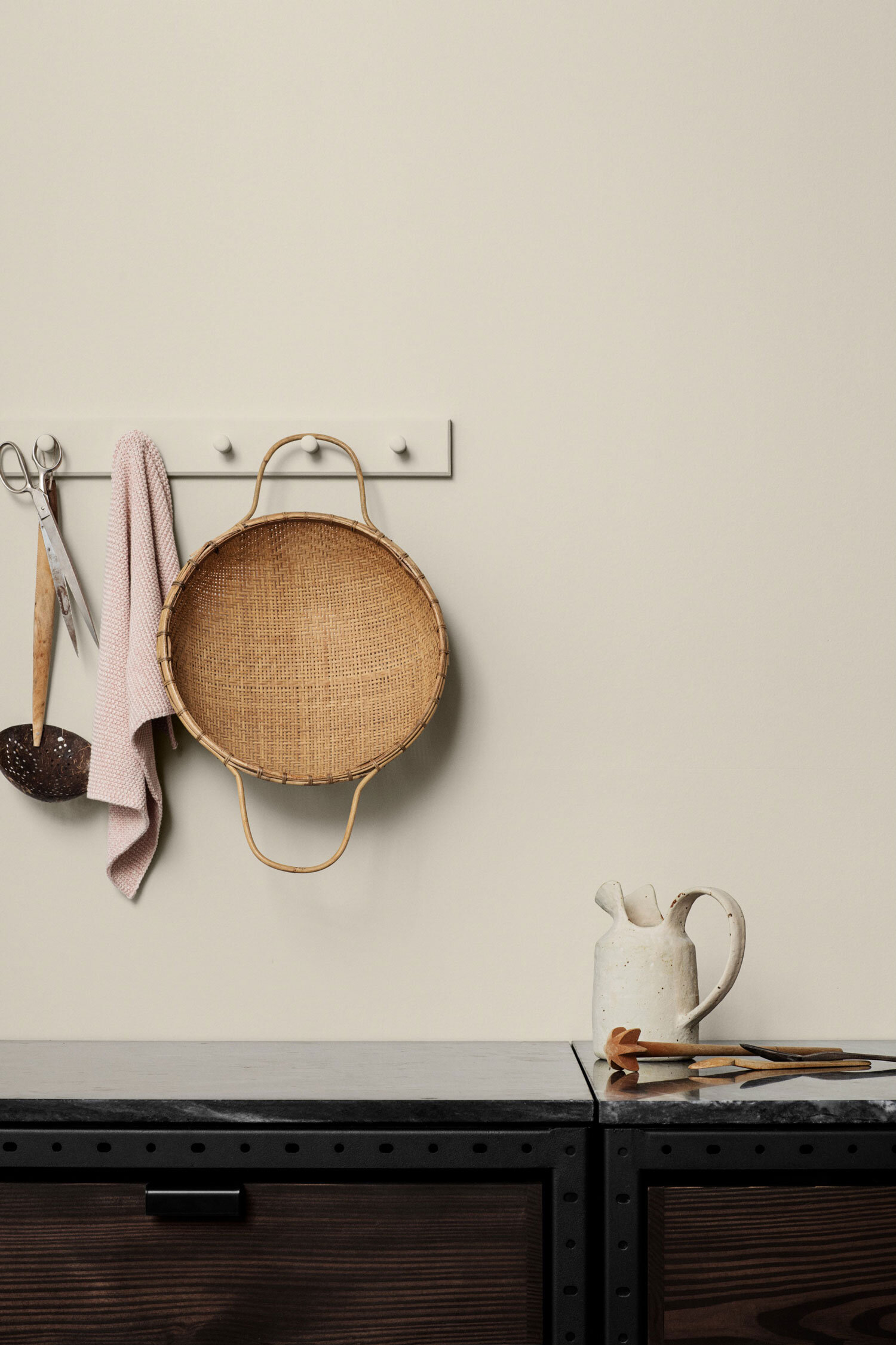
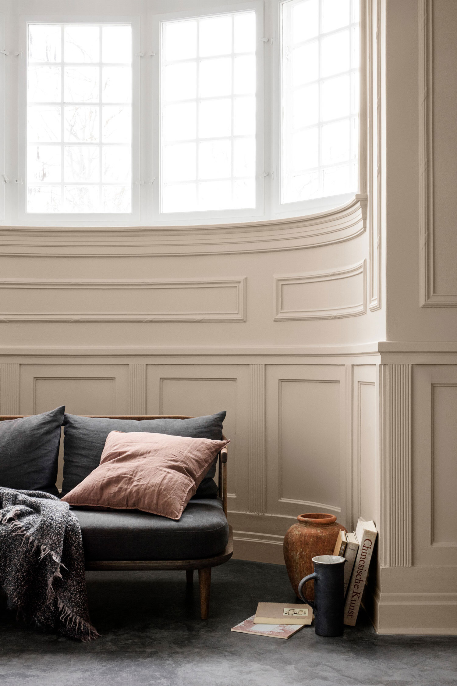
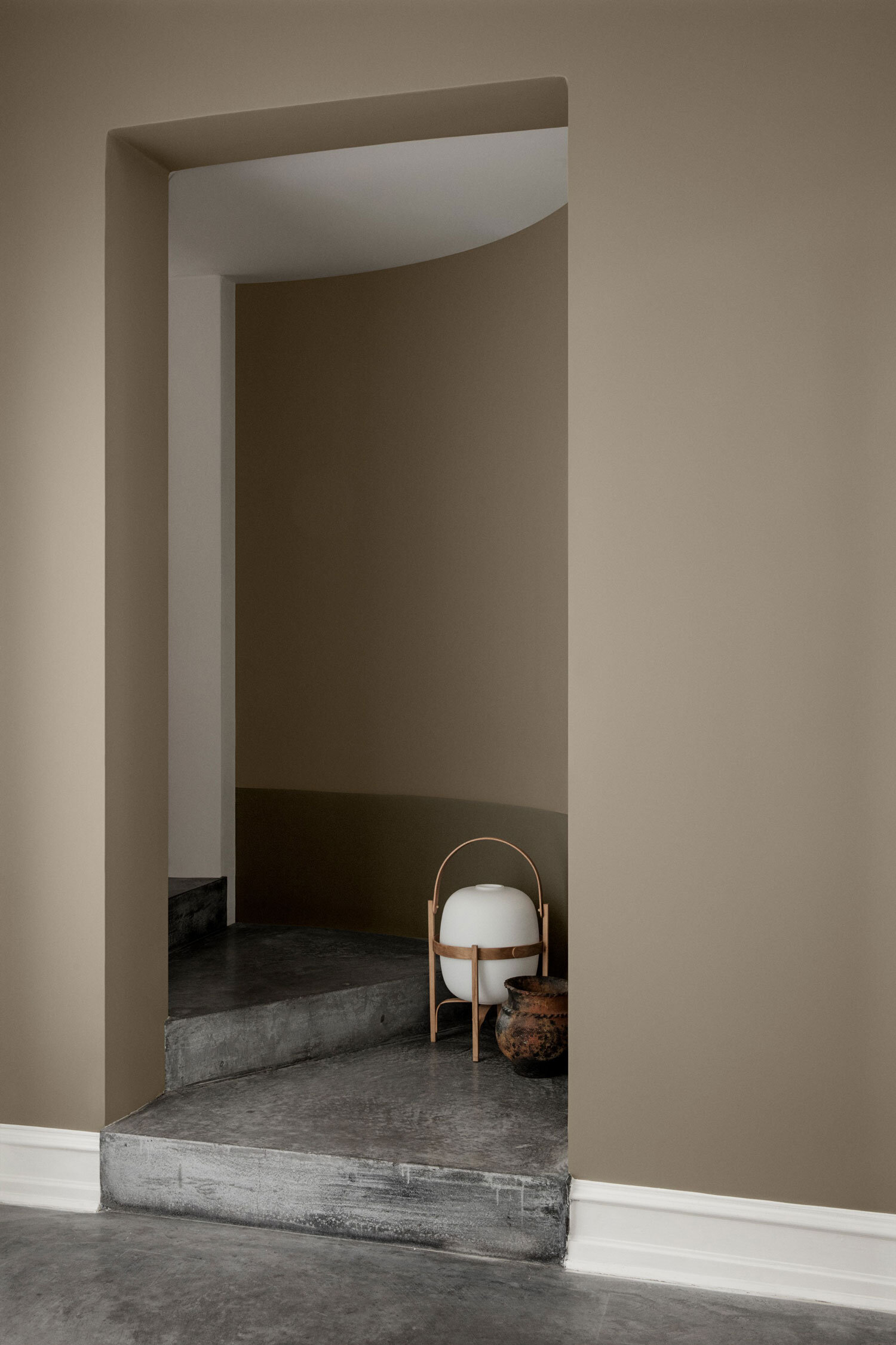
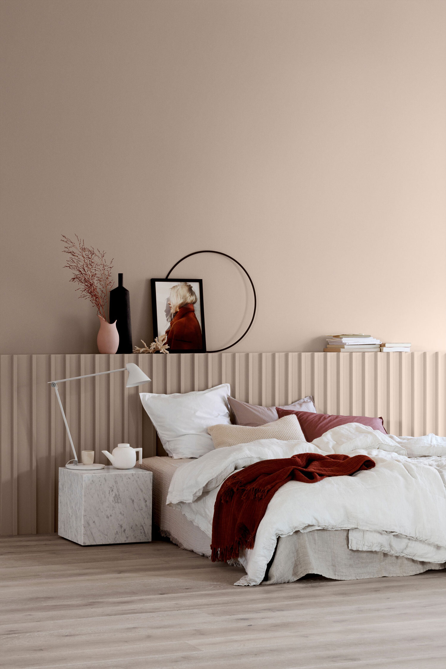
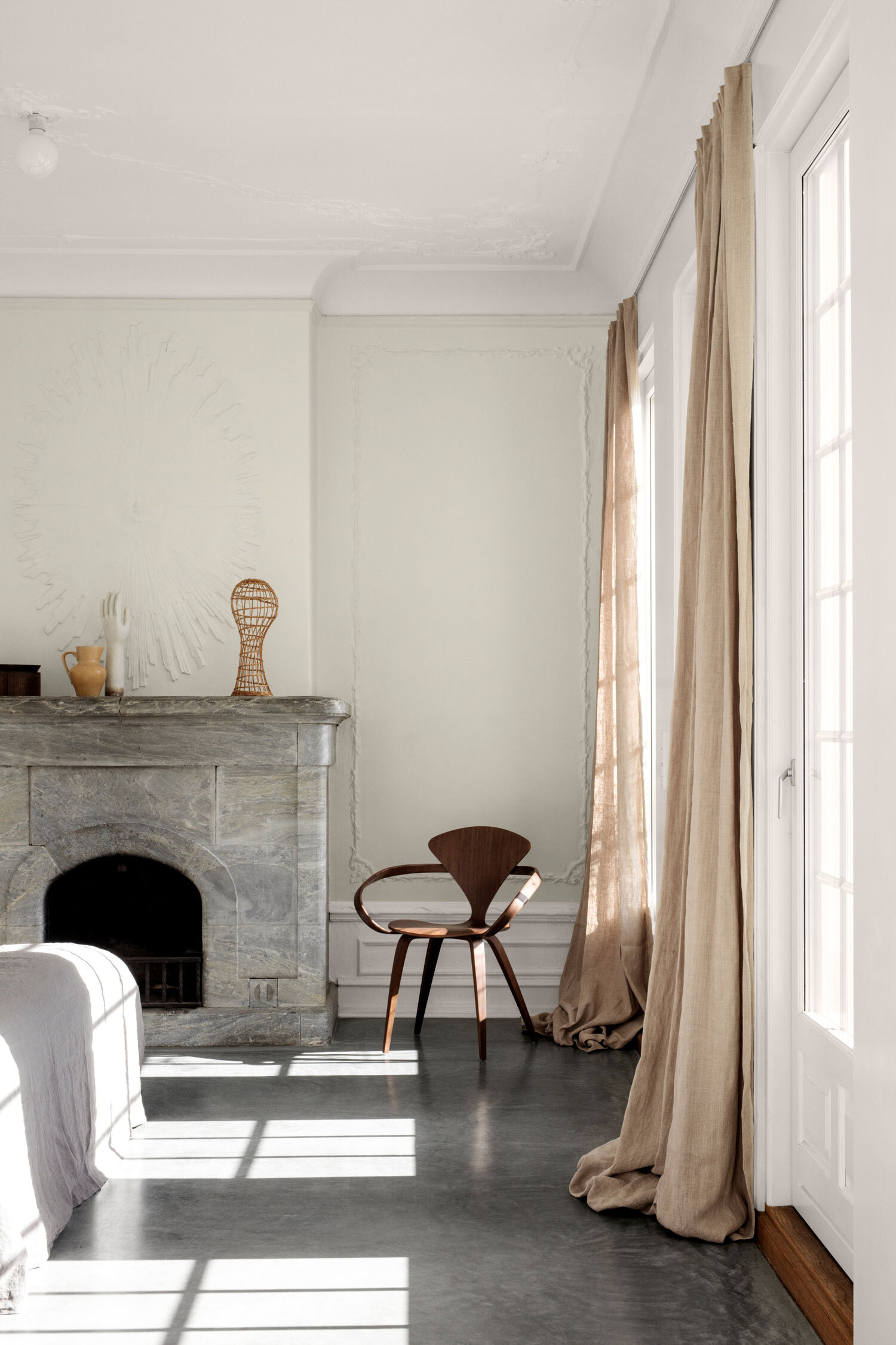
Silent Serenity embodies the meeting point of mindfulness and multiculturalism of the considered, nomadic lifestyle, captured in the light shades of earth and sand – soothing creams, desert pinks and muted peaches.
Images and text www.jotun.com